The She Bohem
Project Description
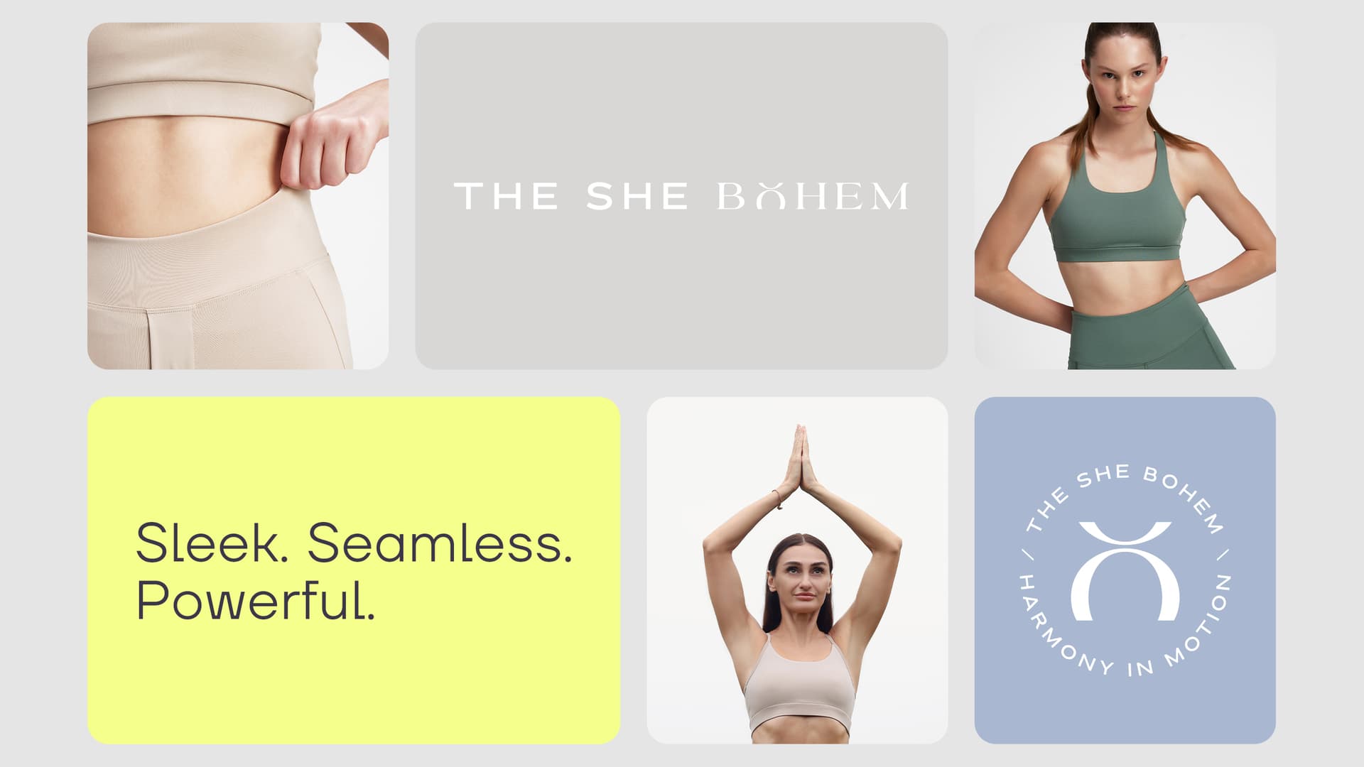
The name “The She” plays on a dual meaning: while it echoes the English pronoun, it also alludes to the Turkish word for “female” (dişi) — tapping into primal strength, instinct, and femininity. “Bohem” references a modern bohemian spirit: free-spirited, mindful, and connected to nature and inner rhythm.
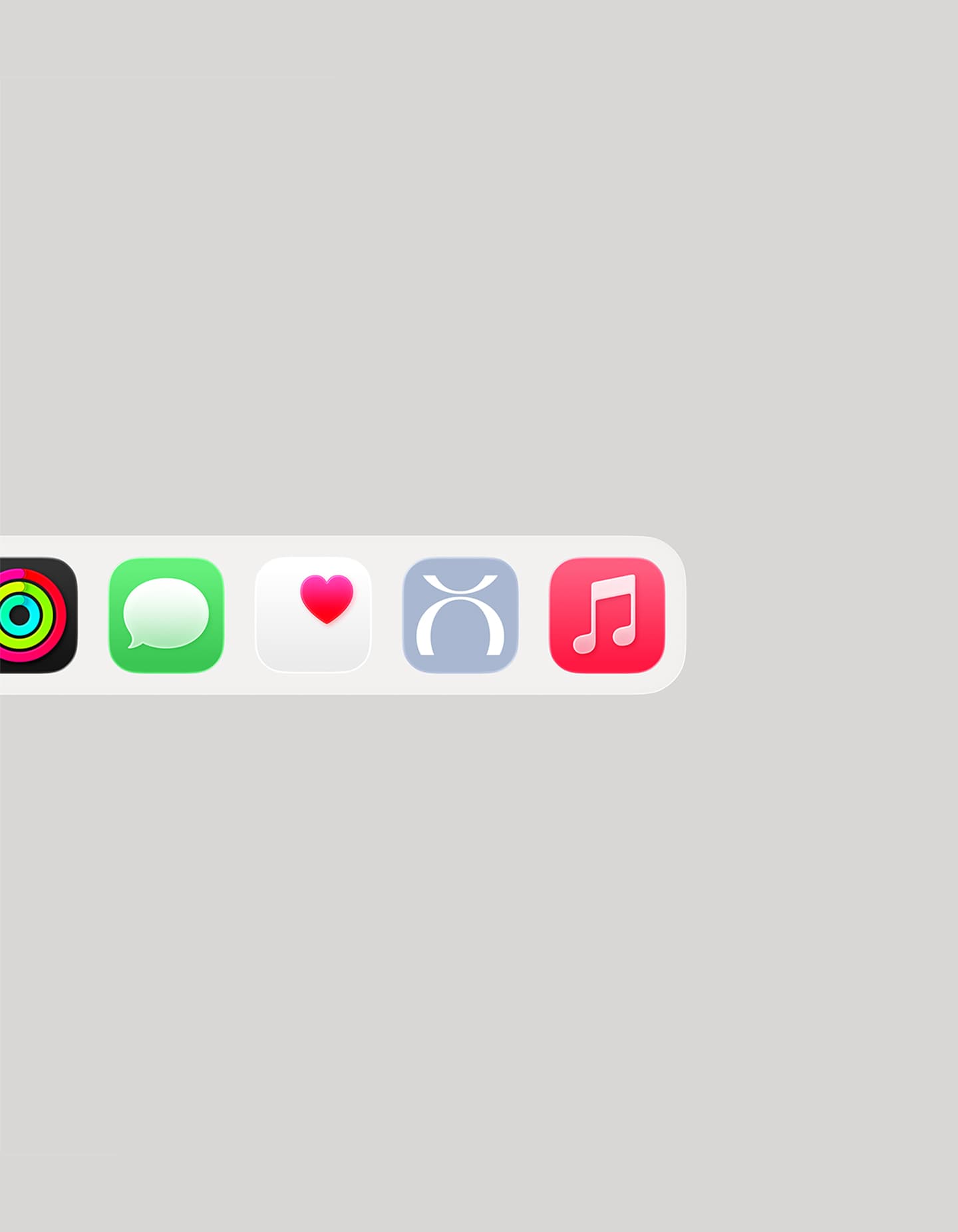
In the logo, the “O” is transformed into a minimalist figure in a yoga pose — merging language and form into a visual metaphor. It quietly conveys the brand’s philosophy: movement is not just physical,
it’s emotional and spiritual.
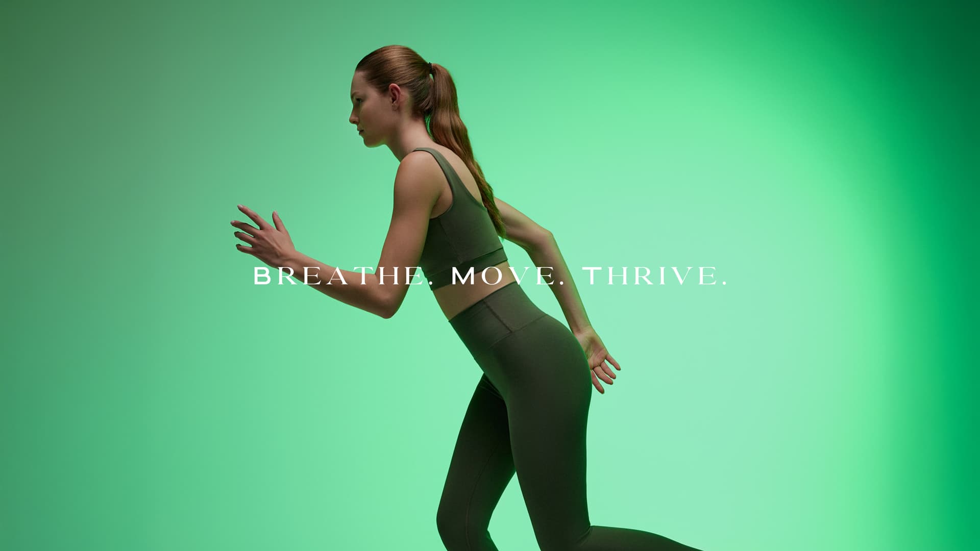
Slogan: Harmony in Motion
The brand’s slogan, “Harmony in Motizon,” encapsulates its essence. “Motion” represents physical activity, movement, flow. “Harmony” symbolizes inner peace, balance, and alignment.
Together, they create a narrative of grace through action
— athleticism not as aggression, but as calm power.
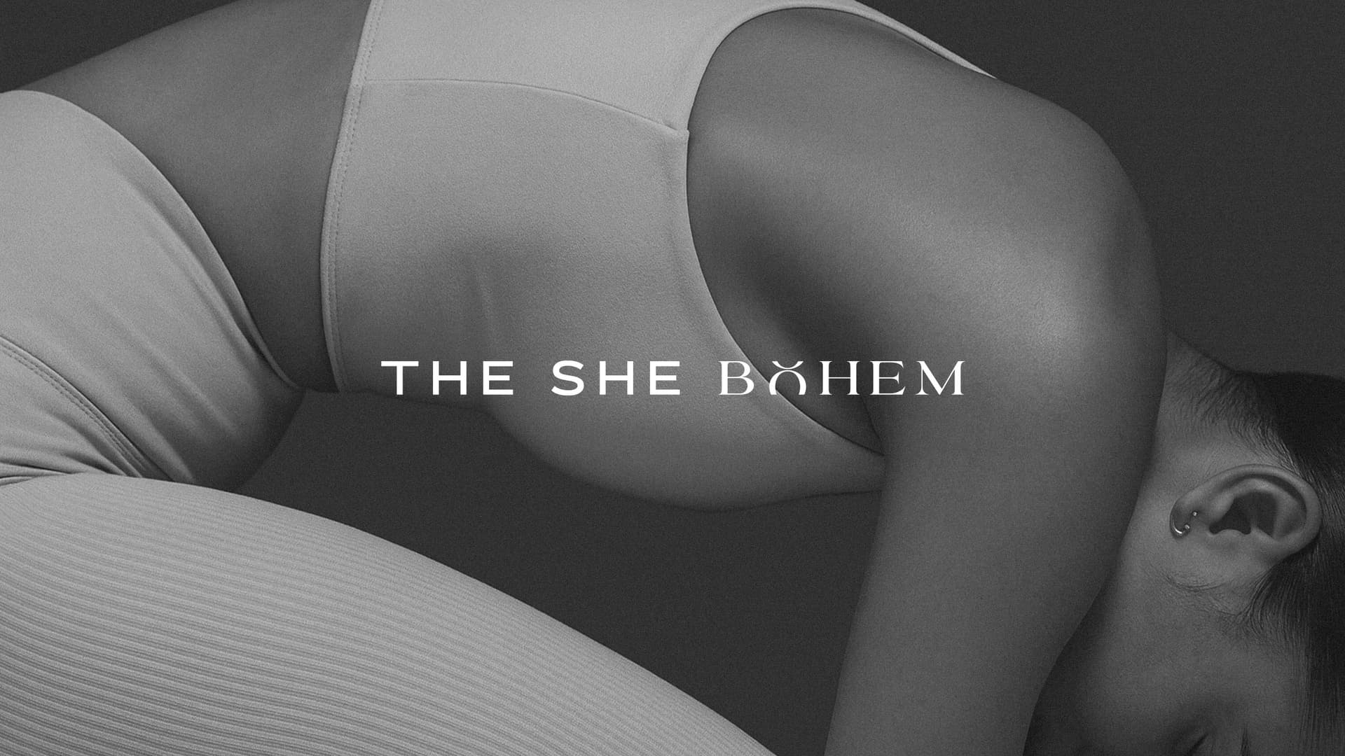
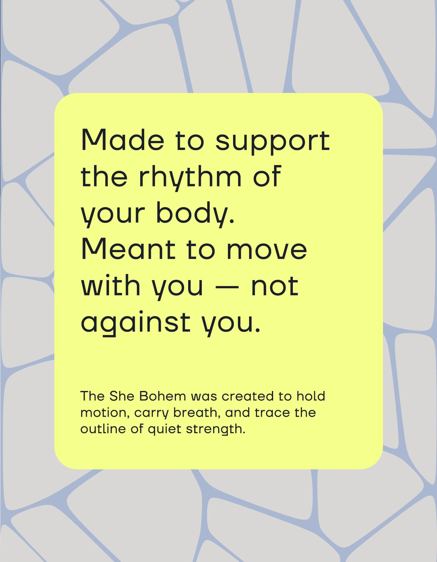
The visual world of The She Bohem is minimal, soft, and elegant.
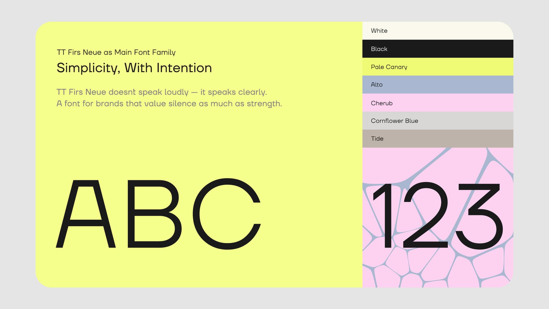
→ A palette of earth tones and warm pastels reflects
a sense of grounded femininity.
→ We chose a sharp, high-contrast serif for typography — embracing a
strong, sculptural aesthetic that reflects the inner strength of the
modern woman.
→ The grid system avoids rigidity — instead, layouts are airy,
responsive, and evoke movement.
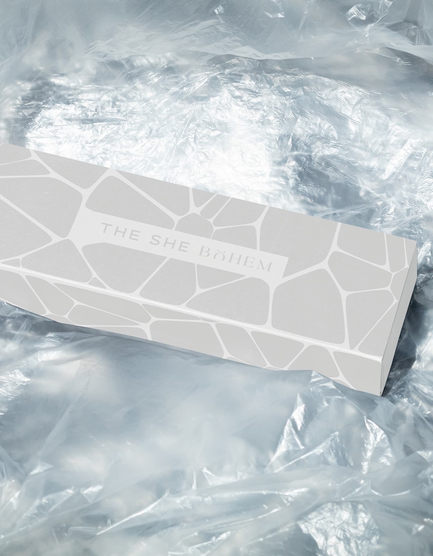
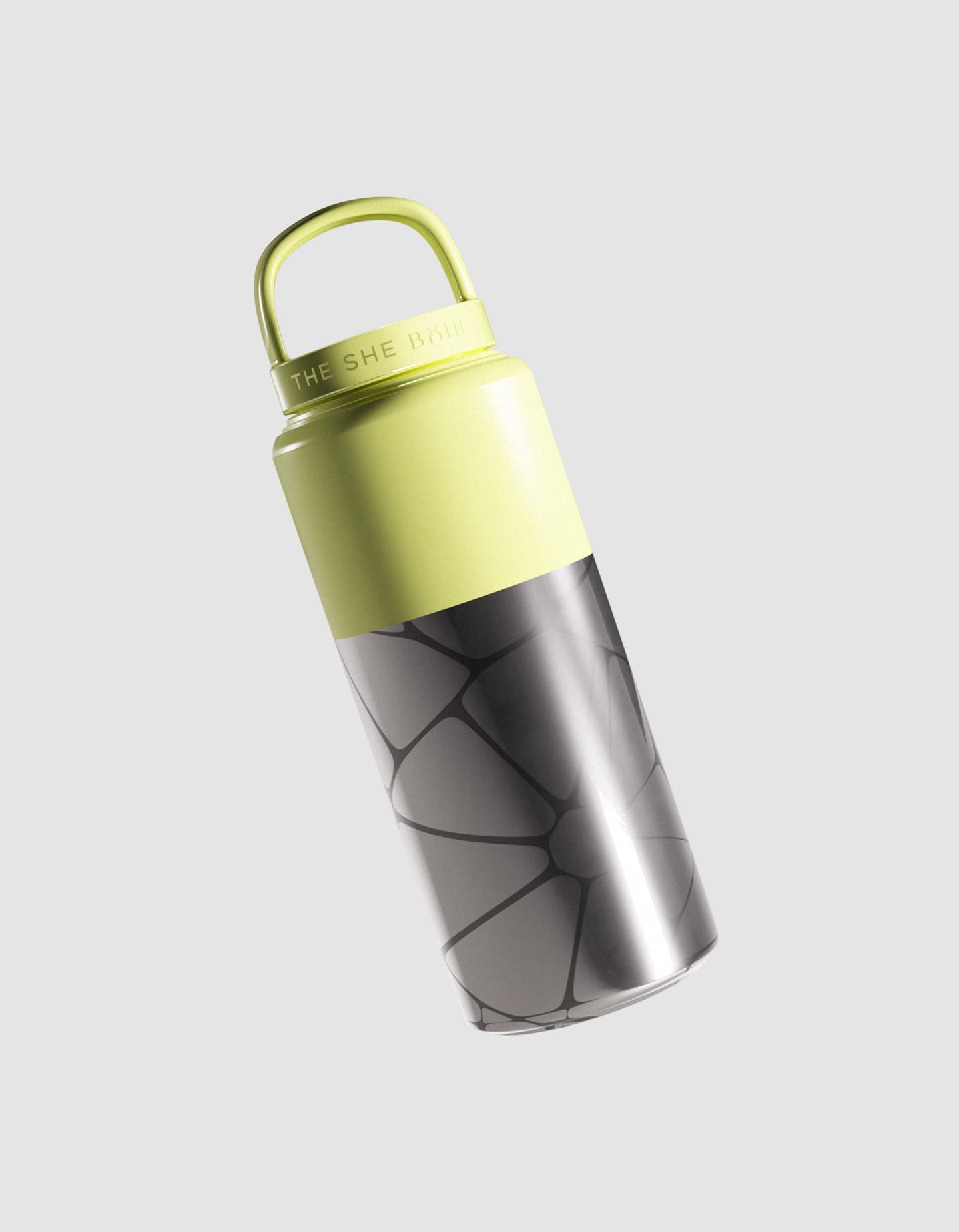
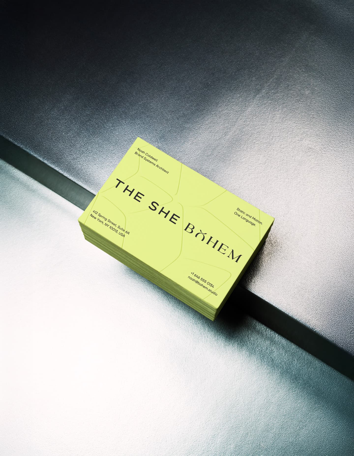
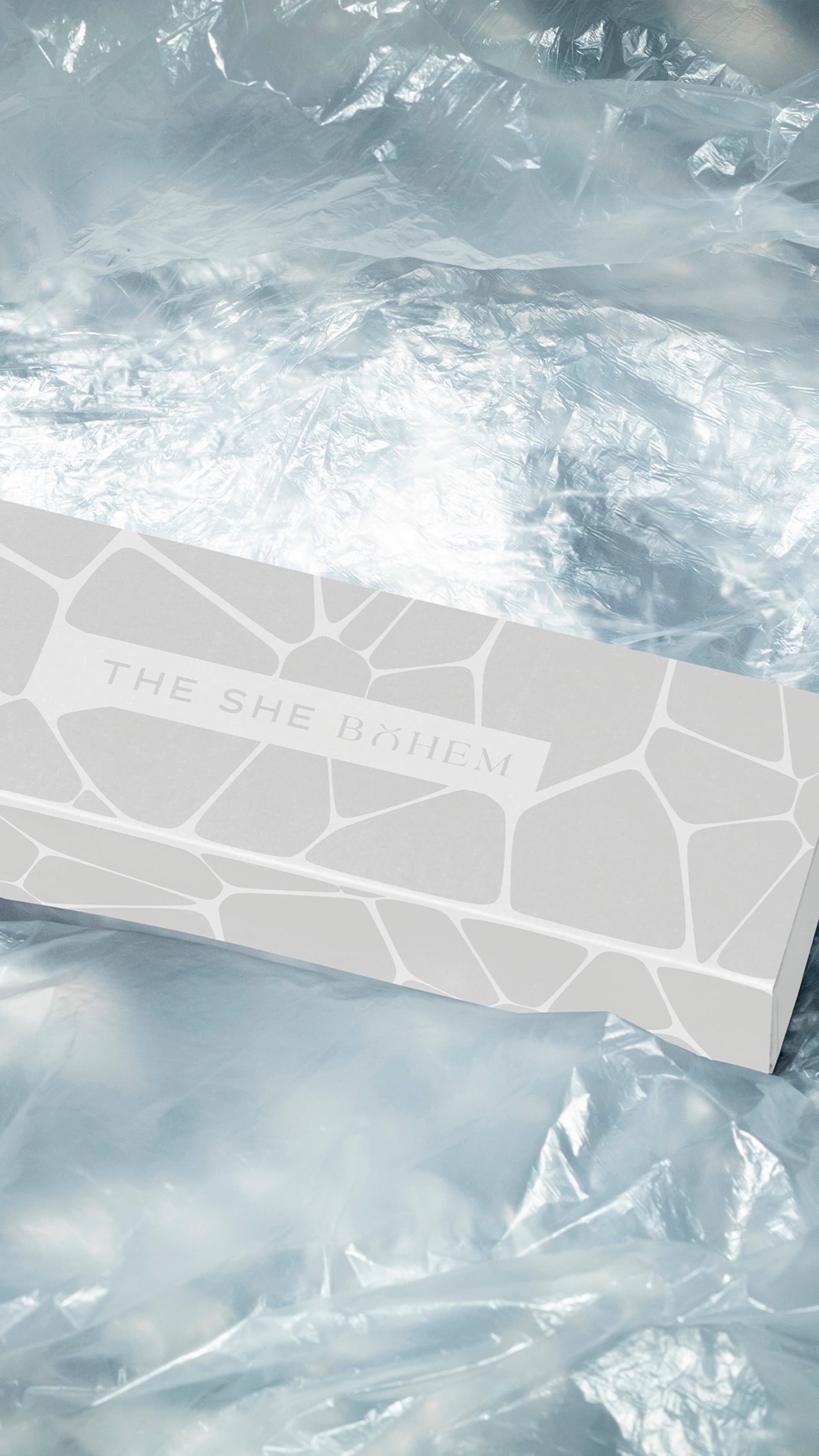
This visual language extended seamlessly from packaging to social media and editorial content.